People are not engaging in the development of their cities.
Product
Notice is a family of three online electronic devices that provide an onstreet communication platform for planning applications and other city notices, replacing the text–heavy sheets of paper that currently reside on lamp posts throughout cities. It is linked to a mobile app and a website which allow the public to quickly and easily respond to planning applications a process that was once far more complex. This modern and simplified method of communication will increase public engagement in city development.
-
Product
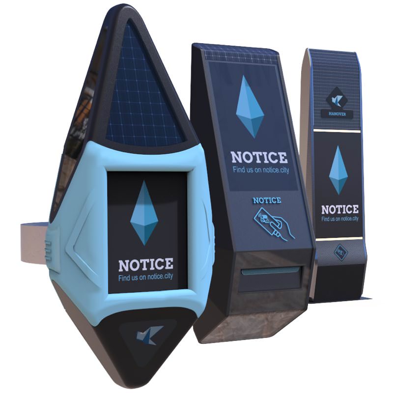
Devices
Why Three Forms:
Notice comes in the different sizes due to the scalability issues with current planning notices. Current planning applications come on the same A4 sheet of paper no matter the size of development. We felt a strong need to distinguish between large and small developments, and we did this through the scale of the products themselves, which come in three forms satellites, comets and hubs.
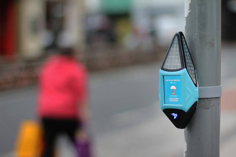
Satellites:
The satellites are the smallest of the three and are permanently situated on every street in the city displaying key information about active planning notices on a lowenergy eink display. They can be interacted with using buttons on the sides, and notices can be ‘saved’ to a user's personal Notice web account for later by scanning an RFID card or holding their phone up to the product.
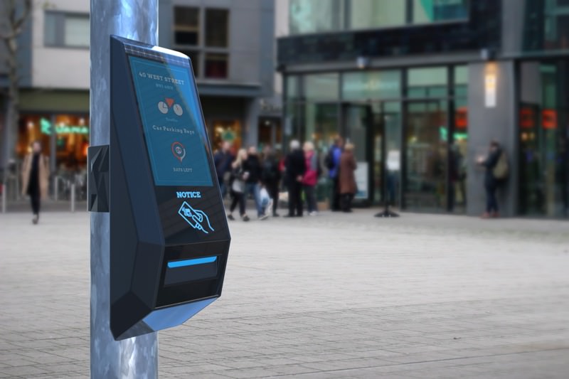
Comets:
The comets depict larger scale developments, and are only put up temporarily while the notice is active. They have the same features as the satellites, though with a larger screen interface and a built in thermal printer to allow the public to take home an aide memoire about the planning notice.
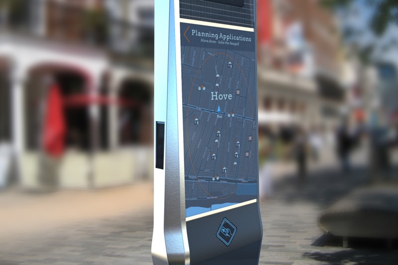
Hubs:
Hubs are the largest of the three, and are situated in each borough of the city in their busiest areas. They feature a map interface displayed on a 46” touch screen, showing each active planning notice in that area. Hubs also house a thermal printer, allowing users to print out information to take home about any active notice in that area.
-
Website
Website
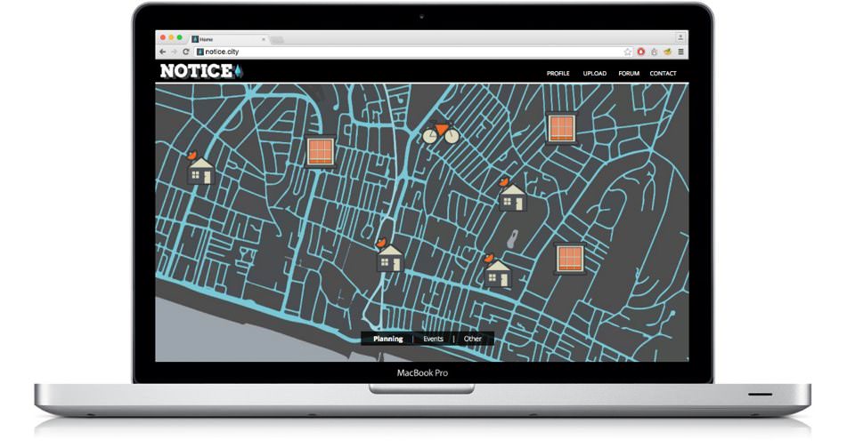
The website connected to this product is a huge part of its functionality. In the backend, the council can remotely upload planning information, saving them the cost of sending out staff to place and remove paper notices. At the front end of the site, the public can browse all active planning notices from the comfort of their own home, or go directly to ‘saved’ notices stored in their user profile that they have interacted with on the streets. Once they have got to the desired notice, they can read more about it, as well as view supplementary imagery, read other people's opinions and quickly and easily lodge a response.
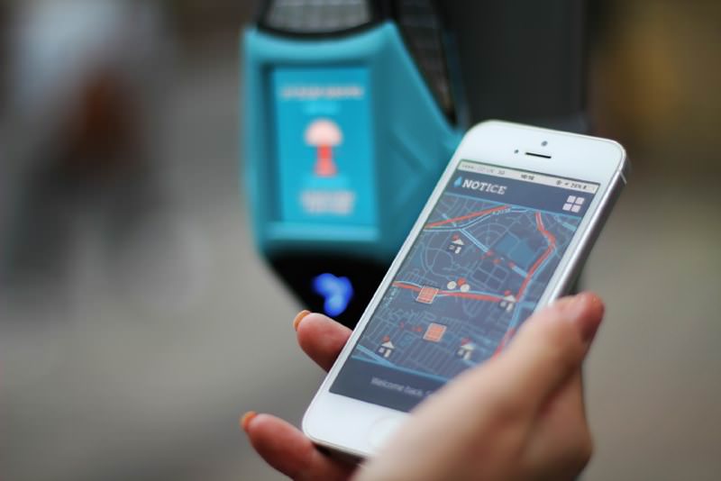
The product is also linked to a native application, which acts as a bridge between the device and the website. This app uses NFC technology, which allows the user to simply hold their smartphone against the device and the active planning notice will be saved to the users account, which can be accessed through the application or the website.
-
Community
Community
An important aspect of Notice is the community platform that it provides. Although its main function is to allow efficient communication between local government and the public, it would also act as a ‘community notice board’ allowing the public to upload moderated information about local events and such.
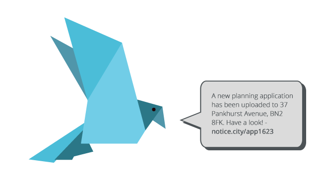
Through research, we discovered that developments are often only heard about by wordofmouth, so it was key that we made a strong emphasis on the ability to share information. This is where the idea of characters stemmed from. Each borough would have a ‘hub’, and it’s own assigned Twitter persona (which would come in the form of an origami animal neutral and in keeping with our branding), which would automatically tweet each time a planning notice was uploaded into that area, with a link to the specific application on the Notice site.
Process
-
Research

Research
Our project started with over a month of intensive research to try and pinpoint an area with which we could design for. After reading through minutes from council department meetings and carrying out an online survey we identified a broad range of areas to delve further into, such as disability, tourism, infrastructure, waste and transport. Upon further research in to these areas, we narrowed them down by personal preference and areas we thought were the richest.
To find out more about our research process, check out our blog… http://clearleftinterns.tumblr.com/
-
Design

Design
Progressing towards the building stages of the project, the team discussed the products form and functionality and then split up to cover separate aspects of the project, with Chris developing the CAD renderings of the models, Monika wiring up and coding the electronics and Chloe designing the interfaces for the app and the website.
To find out more about our design process, check out our blog… http://clearleftinterns.tumblr.com/
-
Build

Build
Progressing towards the building stages of the project, the team discussed the products form and functionality and then split up to cover separate aspects of the project, with Chris developing the CAD renderings of the models, Monika wiring up and coding the electronics and Chloe designing the interfaces for the application and the website.
To find out more about our build process, check out our blog… http://clearleftinterns.tumblr.com/
The People
-
Chloe
Chloe FinlaysonInteraction DesignerI’m a recent graduate from University of Dundee, specialising in screen-based interaction design. I have a passion for all things digital, and interfaces, interactions and experiences are what I’m all about. I enjoy working in both physical and digital spaces to craft rich user experiences. One of my strongest attributes is my ability to communicate. I feel that in user-centred design the ability to empathise with the end user is crucial, and this is something that can only be done through effective communication. I genuinely enjoy meeting people and finding out about their needs. -
Chris
Chris GreenProduct DesignerI recently graduated from University of Leeds with an Integrated Bachelors and Masters Degree with an International year where I achieved a First in Product Design. I took the Clearleft internship to work with different designers and learn what it took to be in a small but successful design agency. Looking forward I wish to pursue my love of all things product design and develop my skills throughout the design process especially within the fields of CAD and visualisations. -
Monika
Monika BansalInformation Experience DesignerI work on the development of the projects through prototyping and working on interfaces between physical & digital. Currently pursuing an MA in Information Experience Design at Royal College of Art, I am interested in the interplay between people, machines, systems and cultures. My work particularly explores the interactive nature of information and the application of new technologies to create compelling experiences.
Programme
3 interns // 3 months // 1 brief
At the start of the internship we were set the brief to improve the lives of Brighton residents using connected technologies. Throughout the internship we had numerous mentors and, although working on a selfdirected brief we were offered a real insight into the inner workings of Clearleft, taking part in workshops and training regularly.
Find out more on our blog
A word from Clearleft…
This internship programme was an experiment for Clearleft. We wanted to see what would happen if you put through talented young people in a room together for three months to work on a fairly loose brief. Crucially, we wanted to see work that wasn’t directly related to our daytoday dealings with web design.
We offered feedback and advice, but we received so much more in return. Monika, Chloe, and Chris brought an energy and enthusiasm to the Clearleft office that was invigorating. And the quality of the work they produced together exceeded our wildest expectations.
We hereby declare this experiment a success!